Comparing the viral quality of resolved genomes and their constituent unitigs
You can combine the resolved genomes (resolved_paths.fasta) and their constituent unitigs (resolved_edges.fasta), and compare the viral quality.
Run CheckV
You can combine the resolved genome sequences and unitig sequences and run CheckV as follows.
# Combine resolved_paths.fasta and resolved_edges.fasta
cat resolved_paths.fasta resolved_edges.fasta > all_sequences.fasta

# Run CheckV
checkv end_to_end all_sequences.fasta checkv_result
Now you can compare and visualise the quality of the resolved genomes and their constituent unitigs. The following example code shows how to visualise the results using Python.
Importing Python packages
Assuming you have installed Python and the packages matplotlib, pandas and seaborn, let's import the following.
import pandas as pd
import seaborn as sns
import matplotlib.pyplot as plt
Load the data
Now we will load the quality_summary.tsv file into a dataframe called checkv_res.
# Load the quality_summary.tsv from the CheckV results
checkv_res = pd.read_csv("checkv_resolved_pathsquality_summary.tsv", delimiter="\t", header=0)
Format the data
Now we will convert the sequence lengths into kilobases by dividing the lengths by 1000.
# Format the genome length to kb
checkv_res['contig_length'] = checkv_res['contig_length'].div(1000)
Then we will add a new column to our dataframe called Sequence type to denote whether the sequence is a resolved genome or a unitig.
# Add a new column as "Sequence type"
seq_type = []

for index, row in checkv_res.iterrows():
    if row['contig_id'].startswith("phage"):
        seq_type.append("Resolved genomes")
    else:
        seq_type.append("Individual unitigs")

checkv_res.insert(2, "Sequence type", seq_type, True)
Plot the data
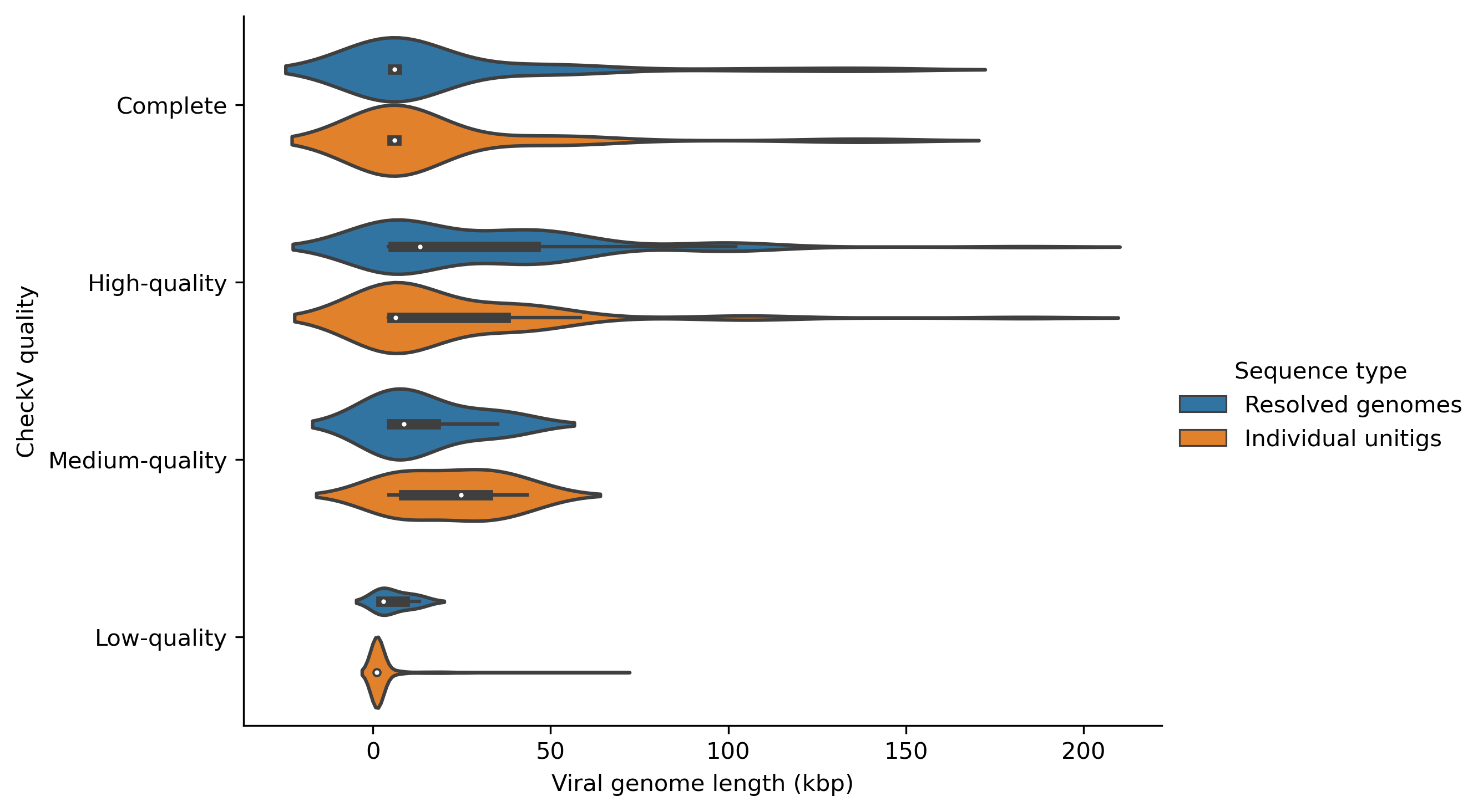
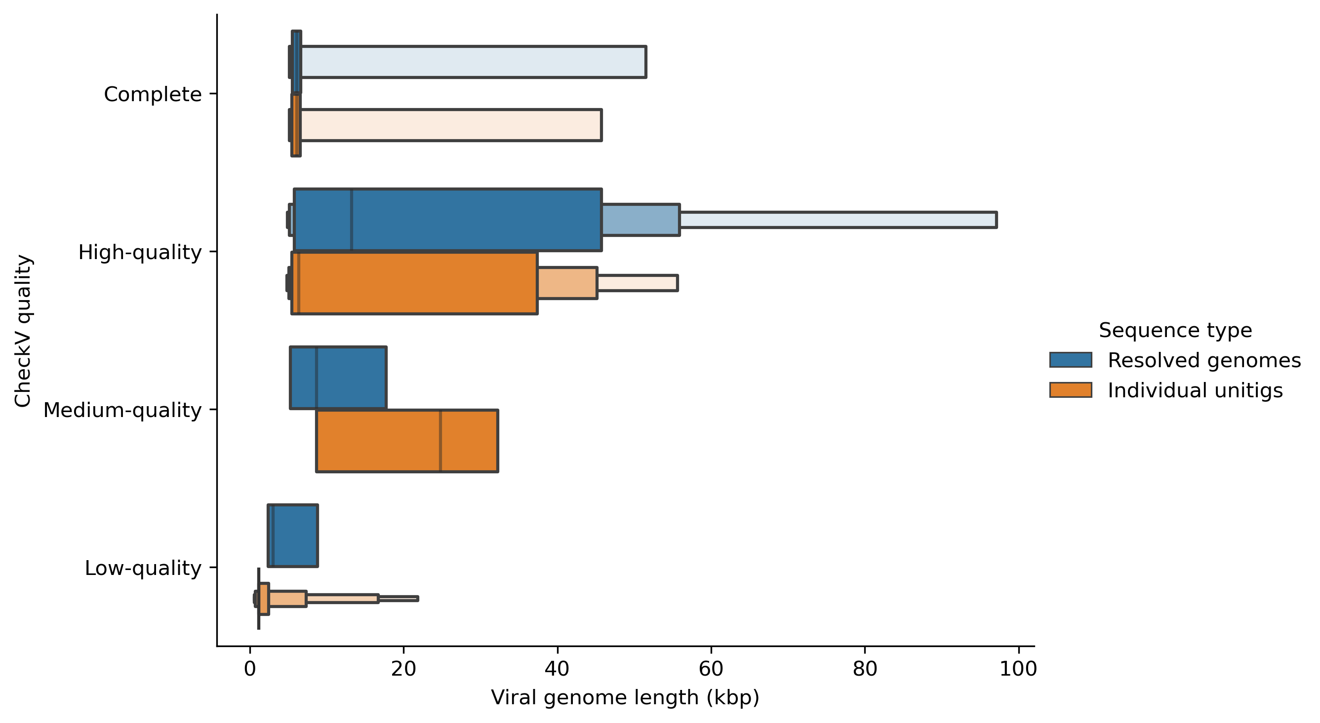
Now we can plot the viral quality (Complete, High-quality, Medium-quality or Low-quality) of the resolved genomes and their constituent unitigs using boxen plots and the save the figure as follows.
# Set the order of viral quality
myorder=["Complete", "High-quality", "Medium-quality", "Low-quality"]

# Plot using catplot
ax = sns.catplot(y="checkv_quality", x="contig_length", hue="Sequence type", kind="boxen", data=checkv_res, height=5, aspect=1.5, order=myorder, showfliers=False)

# Set axis titles
ax.set(xlabel='Viral genome length (kbp)', ylabel='CheckV quality')

# Save figure
plt.savefig("checkv_qual_boxen.pdf", dpi=300, bbox_inches='tight', format='pdf')
You can change the kind of the plot as you wish. For example, you can draw a violin plot by changing kind="violin" as follows.
ax = sns.catplot(y="checkv_quality", x="contig_length", hue="Sequence type", kind="violin", data=checkv_res, height=5, aspect=1.5, order=myorder, showfliers=False)